projects in orbit
Samples of work from clients whose vision we've helped put into orbit.
Looking for something specific not featured here? Just ask. This isn't an exhaustive list, so we just might have what you're looking for for your next project.

Web Design
expo management
Working with Amanda Wolfe through Growco Lab was an exceptional experience. She built a beautiful, modernized website for my client, and the entire process was seamless from start to finish. Her communication was clear and consistent, the final site exceeded expectations, and her customer service was truly above and beyond. My client is absolutely thrilled, and so am I. Highly recommend! ⭐️⭐️⭐️⭐️⭐️
–Halee S.
Branding • Web Design • MEdia
Brandy Lydon / Lydon Properties
Bringing real estate and wealth building into one cohesive home through branding and web development. Now, we continue to support Brandy in her podcast as a form of lead generation and authority-building.


Branding • Web Design
TOUCH OF CLASS CONCIERGE
Growco Lab partnered with Touch of Class Concierge: A Debbie Page Signature service to capture the values and finesse behind Charlotte's premier lifestyle management brand.
Branding • Web Design
East Tennessee Earth Works
"Amanda has done a great job giving a face to our business! Her team has nailed every detail and we will continue to use them for all our website demands in the future. I couldn’t recommend Growco Lab enough!"
– Cody, co-founder


Video • Web Design
The BACK in Action Podcast
Growco Lab provides ongoing production support for The Back In Action Podcast and now programming as well. When the podcast completed its first full season and needed more than Instagram and YouTube to capture programming leads and attract sponsor opportunities, we were able to knock out a one page website with speed and cohesion before the launch of the program.
Video
Armor Gym
While no longer an active media partner for storytelling short form content, we were able to provide interim video support for evergreen story assets to showcase member transformations and gym culture that continue to be in circulation, as well as provide media support for their second location opening.


Branding
Mellow: a lifestyle brand
When bringing an elevated lifestyle brand to South Knoxville, Mellow worked with us to create an identity that captured their vibe.
Web • Photo • Video
Monkey's Bar
Monkey’s Bar is the warm and welcoming place to hang out with friends, meet new people, and become a new favorite hang. Their old site didn't quite capture that though. That's where we came in.


Web
Carepoint, Inc.
When Carepoint wanted to bring their website up to date and under their own roof, they turned to us. Now they're set up to stand up in the Charlotte market with their professional, compassionate, and truly individualized home care services.
Branding • Web
Shane Edward Tanzosh ARVC Heart Foundation
This family-founded nonprofit sought to honor the legacy of their son while raising awareness and funding for the rare genetic condition that took his life.


Web • Print
UTurn Consulting
UTurn Consulting came with a fresh logo kit from an external designer and needed to see it expanded into web and print.
Web • Supporting Design
Valorous Academy
This private school's parent organization rebranded (externally) and with it came the need for a new website and a long list of supporting design assets as they implemented and expanded the new look.


Branding • Web
Chris Manning Communities
We we began working with Chris and his team, he had a reputable name in the community but multiple business identities that didn't always carry over into their different industries.
Web • Book Design
Becoming Me TV
Becoming Me TV is a community built on storytelling and encouragement for life's journey. Being able to partner with founder Emily to make the BMTV user experience on the web cohesive with her first book that published through KDP.


Web • Copywriting • Video
Small Batch Fab
As micro factory making big ideas happen, Small Batch Fab needed an online space that showed off their capabilities and work.
Branding • Roomscape • Web
OneBody Fitness
When Ginny took over OneBody Fitness, she wanted to create a gym environment that was colorful, open for all levels of fitness, and chalked full of motivation.


Supporting Design • Roomscape
Rustic Roast
This Conway, SC favorite coffee shop has been a recurring client. Being able to assist with menu design, large format printing, crafting kiosk setup at a second location, merch, and more has been a blast.
Web • Brand Photography
Shaka Laka Bowls NMB
When the premiere açaí bowl shop of North Myrtle Beach needed their ordering system and website up to par with their next-level service and product, Growco Lab came to deliver.


Experience Design • Large Format Print
Elevation Blinds
While Elevation Blinds has been a repeating client over the years, a highlight was assisting them with a trade show experience that set them apart from the rest and converted to real, warm leads.
Branding • Print • Web
Owl Street Content
When Alyssa came in, she had a company name but needed a visual identity that she felt just as confident and connected to.


Branding • Web • Print
Gretel Uys Life Coach
Gretel needed a brand identity that held space for contrast, growth, and transformation.
Video • Photography
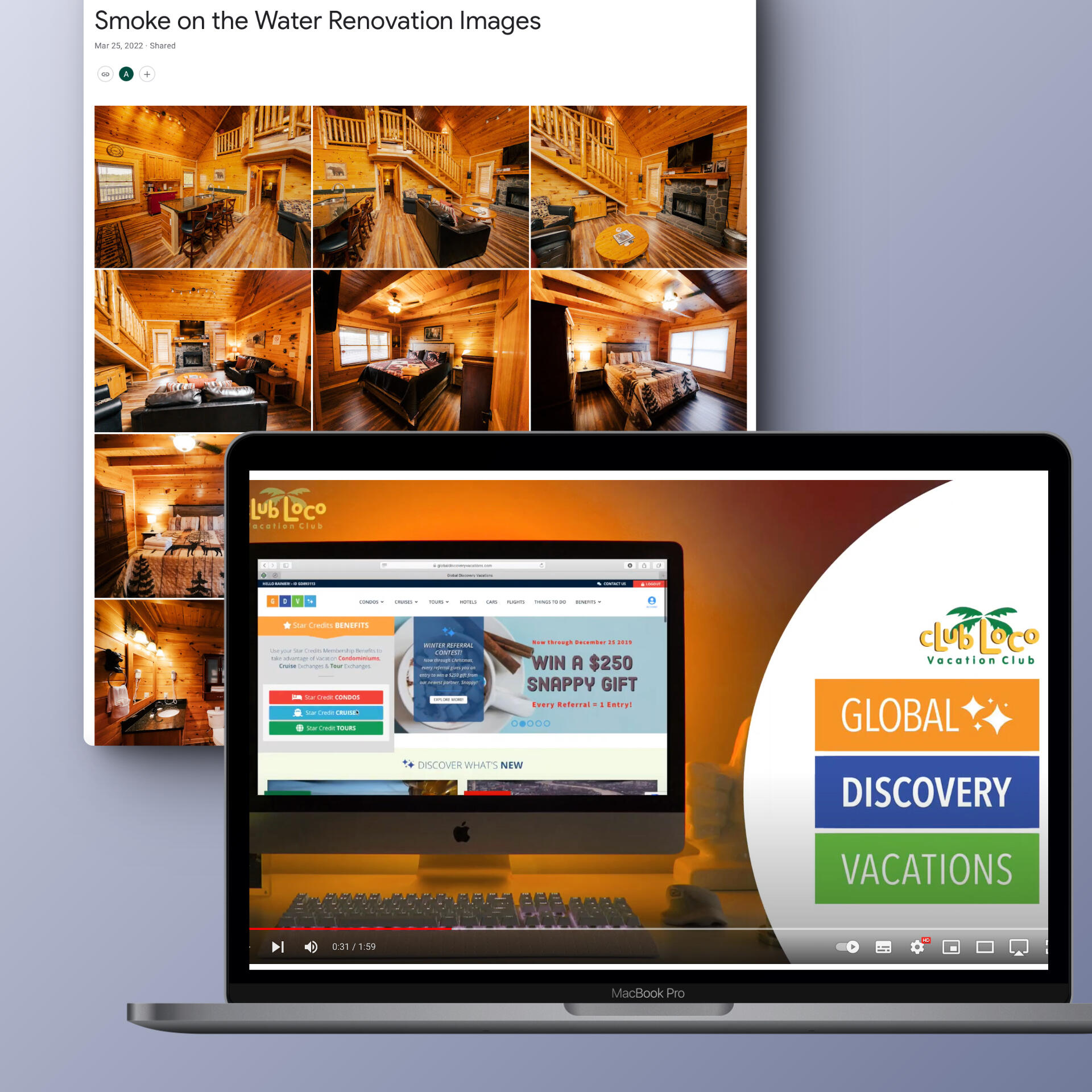
Club Loco Vacations
Club Loco is a recurring client who has needed plenty of video and photo support over the years, and Growco Lab is proud to deliver.

Grand strand charter arts high school
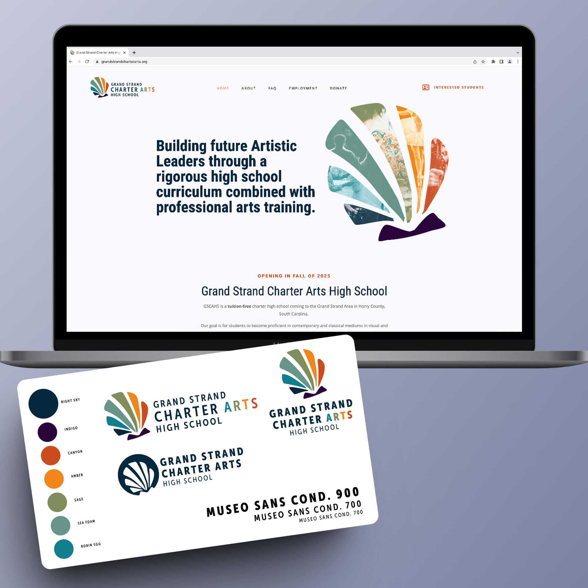
Located in the Grand Strand of the Carolina Coast, GSCAHS looked to Growco Lab to provide a design system that would set them up for years to come.One of the inspirations behind the design was using colors to signify different focuses in the performance art this school would offer. Their palette was designed to blend coastal colors with vibrant and energizing complimentary colors. A seashell was modernized for tying in the Grand Strand culture, while also designed to set them up as an additional way to signify the different focuses the school will offer.
Touch of Class Concierge
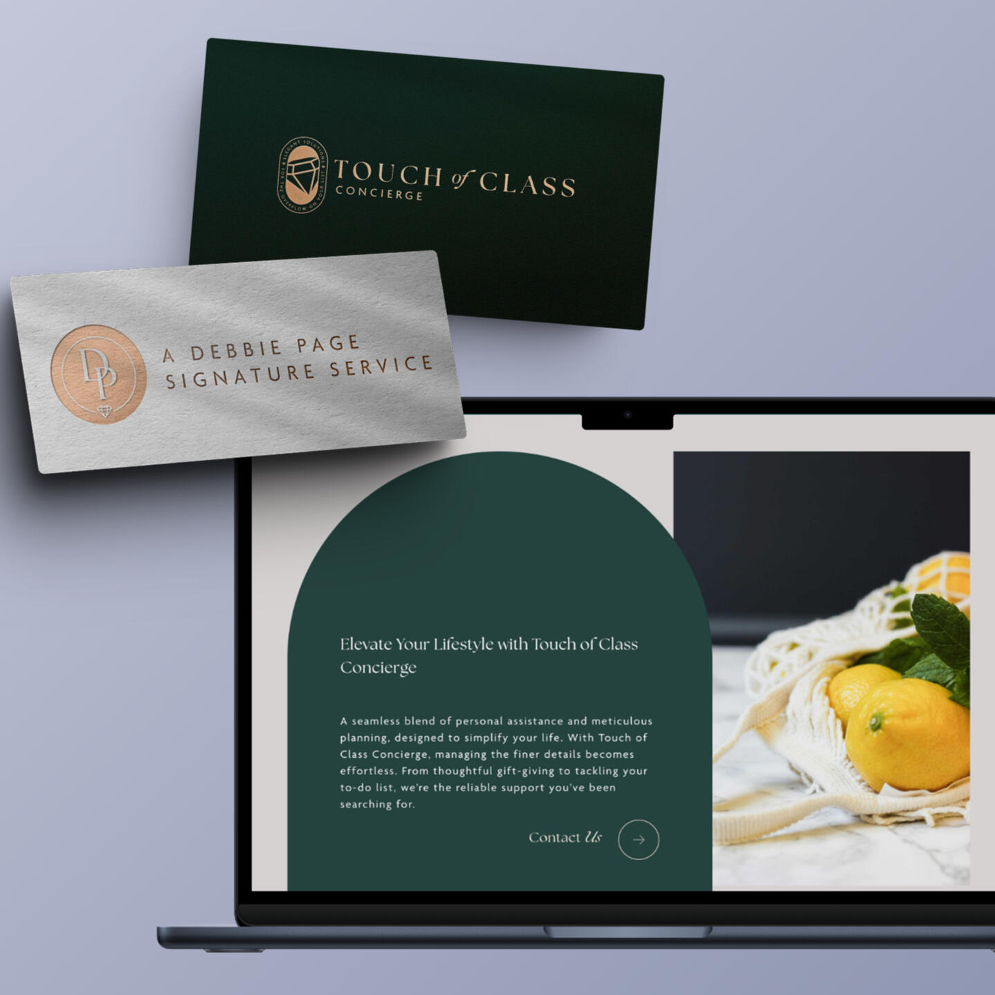
Luxury. Elegance. Simplicity.
With Touch of Class Concierge, Growco Lab was trusted with capturing the essence of the tailored and meticulous care Debbie brings to her personalized concierge services, both in branding and web design.
Mellow: a better lifestyle
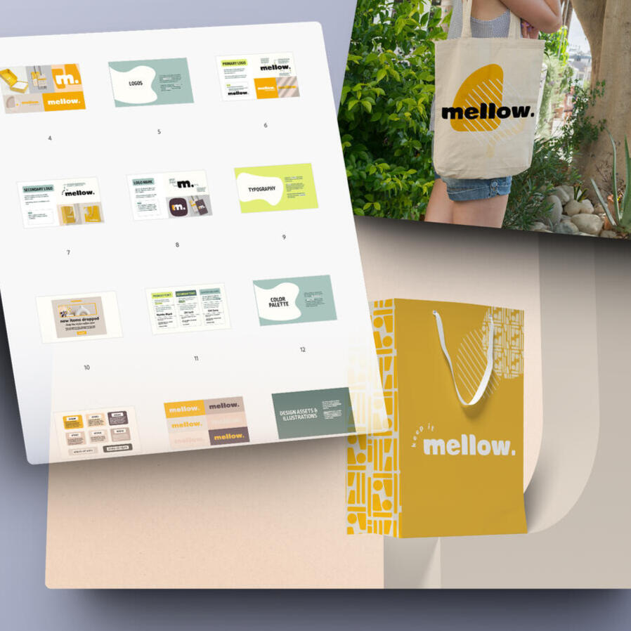
Keep It Mellow
"Mellow" is a vibrant and mid-to-high-end lifestyle brand and shopping experience entering the Knoxville market. The Mellow lifestyle emphasizes individuality, confidence, and a passion for life. Combining fun and funky with smooth, flowing aesthetics, Mellow as a brand identity was designed for those who seek out conversation-starting pieces or curate a cozy, intentional space to align with their lifestyle design.
MONKEY'S BAR
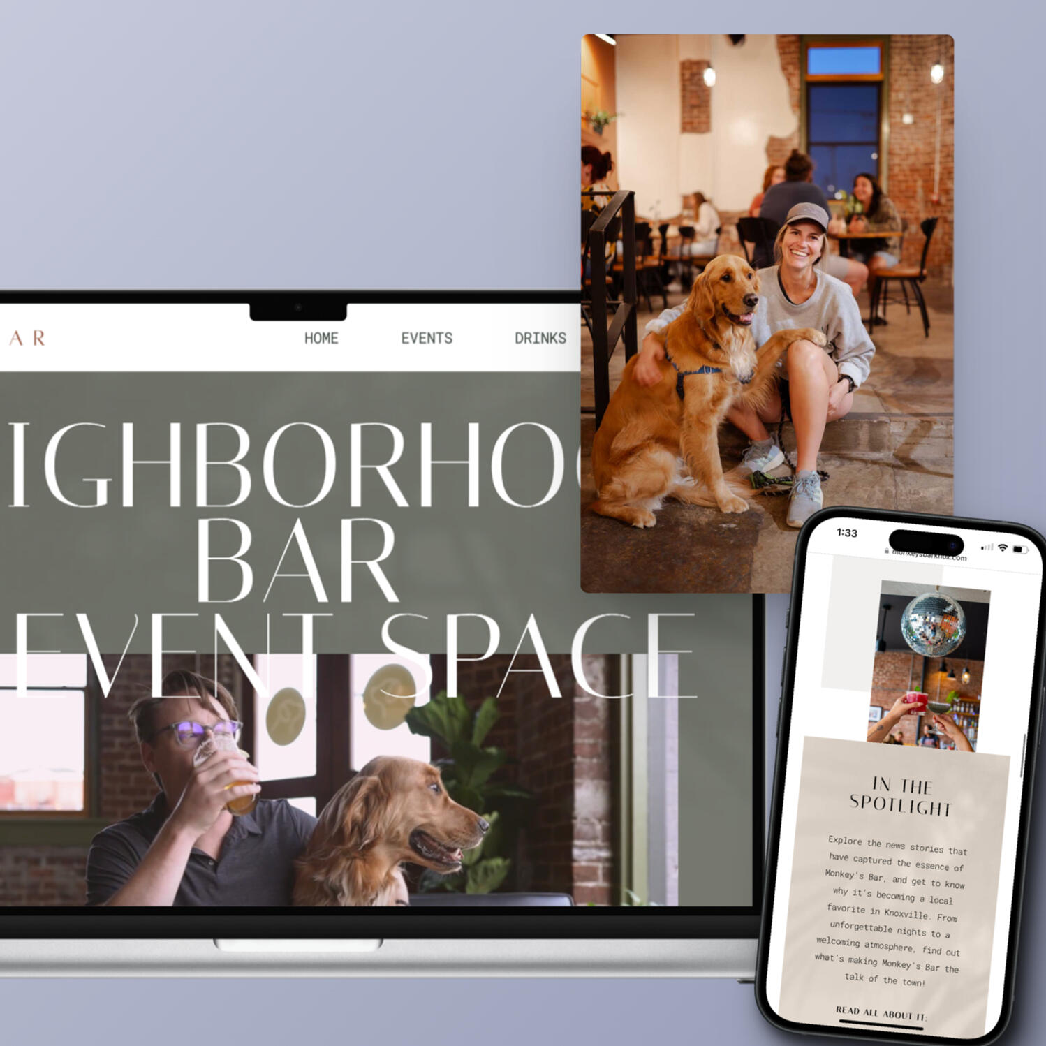
Monkey's Bar: Neighborhood Bar + Event Space
With Monkey's Bar, we created a space online that showcases the bar's unique personality through photo, video, and a functional and beautiful design––inviting patrons to explore the excitement before even setting foot through the door.
CAREPOINT, INC.
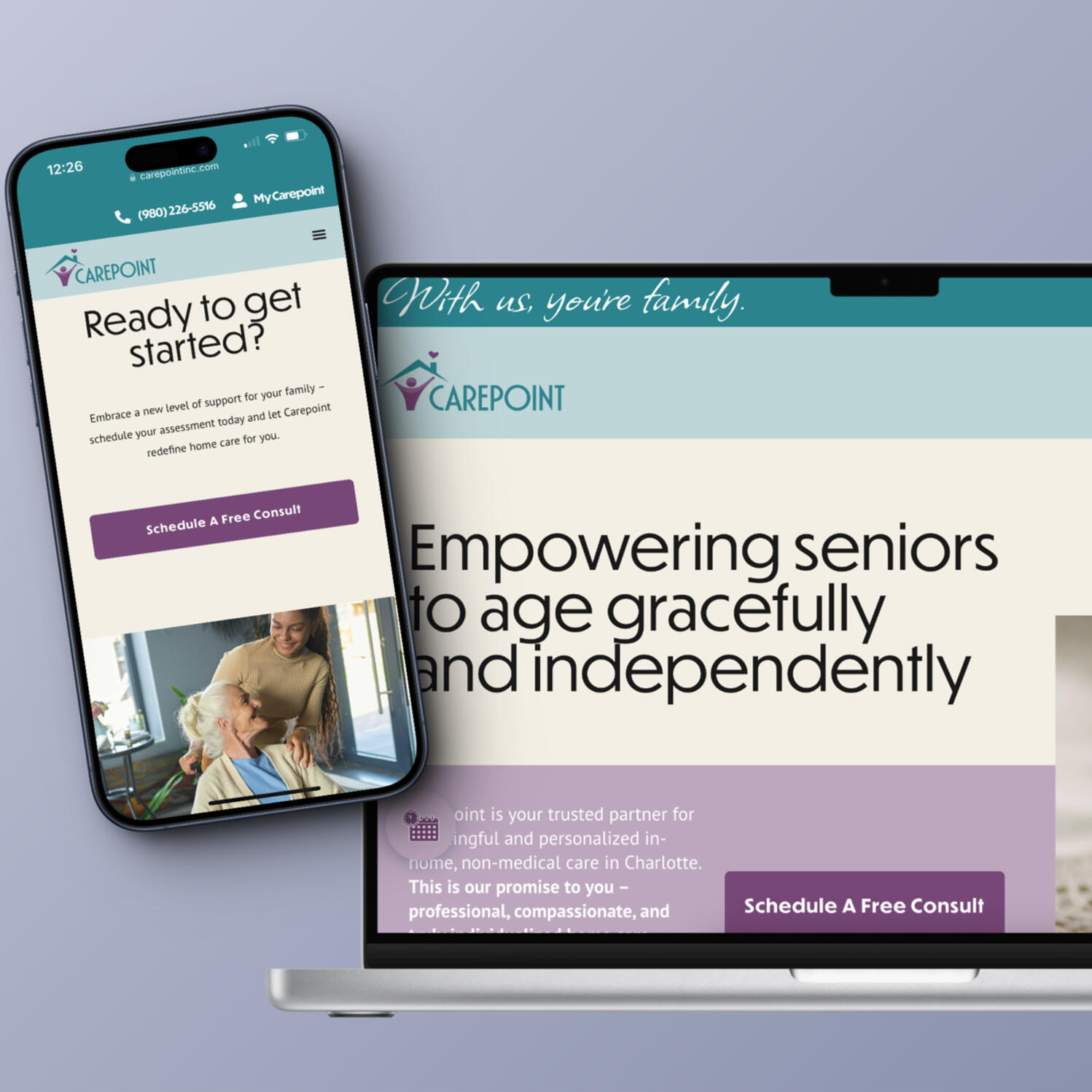
Carepoint, Inc. came to Growco Lab with existing brand assets, looking to elevate their online presence.
Now they're set up to stand up in the Charlotte market with their professional, compassionate, and truly individualized home care services.
Shane Edward Tanzosh ARVC Heart Foundation
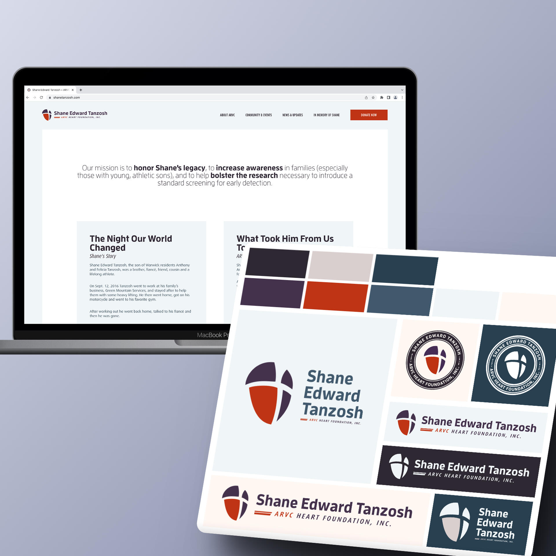
This family-founded nonprofit sought to honor the legacy of their son while raising awareness and funding for the rare genetic condition that took his life.When creating the brand identity for this ARVC Heart Foundation, the primary goal was to keep Shane at the center. One of the things he loved most was basketball. We crafted the icon with basketball detailing inset into the abstract shape of a heart. The one chamber dual colored signifies the genetic anomaly that ultimately became fatal for Shane and other young people with ARVC.With their modernized look, resourceful website, and fully adaptable color and logo system, the family and supporters have been able to make more traction in their goal to partner with organizations raising awareness and working towards a finding a cure.
UTurn Consulting
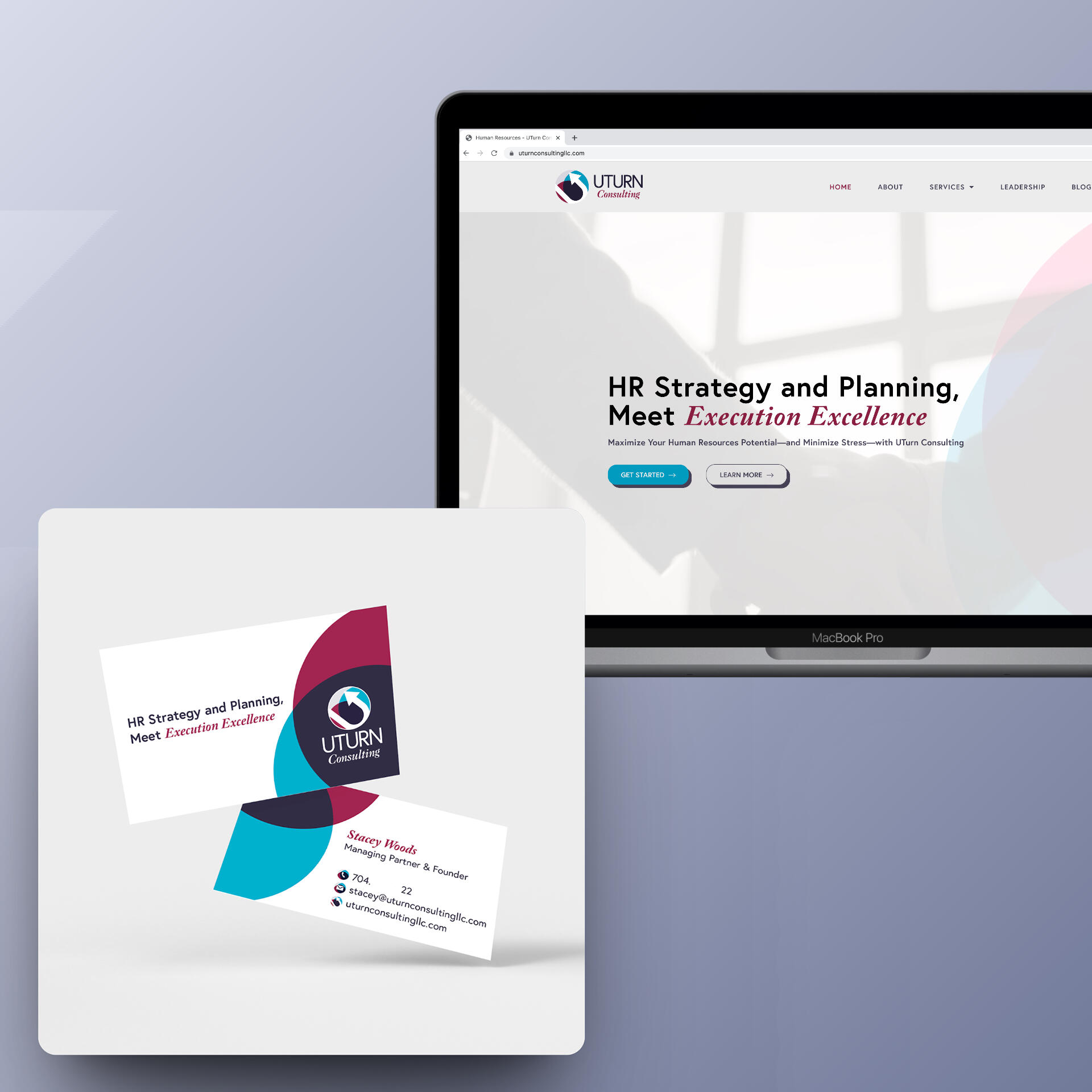
UTurn Consulting came with a fresh logo kit from an external designer and needed to see it expanded into web and print.
With a partnership with her copywriter of choice, Stacey's site bloomed to life and positioned her to launch into this new chapter of her career. She was also elated over her business cards: a velvet finish with raised spot UV was hand-picked to compliment the design. When they were drop shippedto her door, she said they felt "luxury - truly high end", which sets her up for making a strong impression with potential clients. Her site and cards are confident reflections of who she is as a leader and the business she is establishing.
Valorous Academy
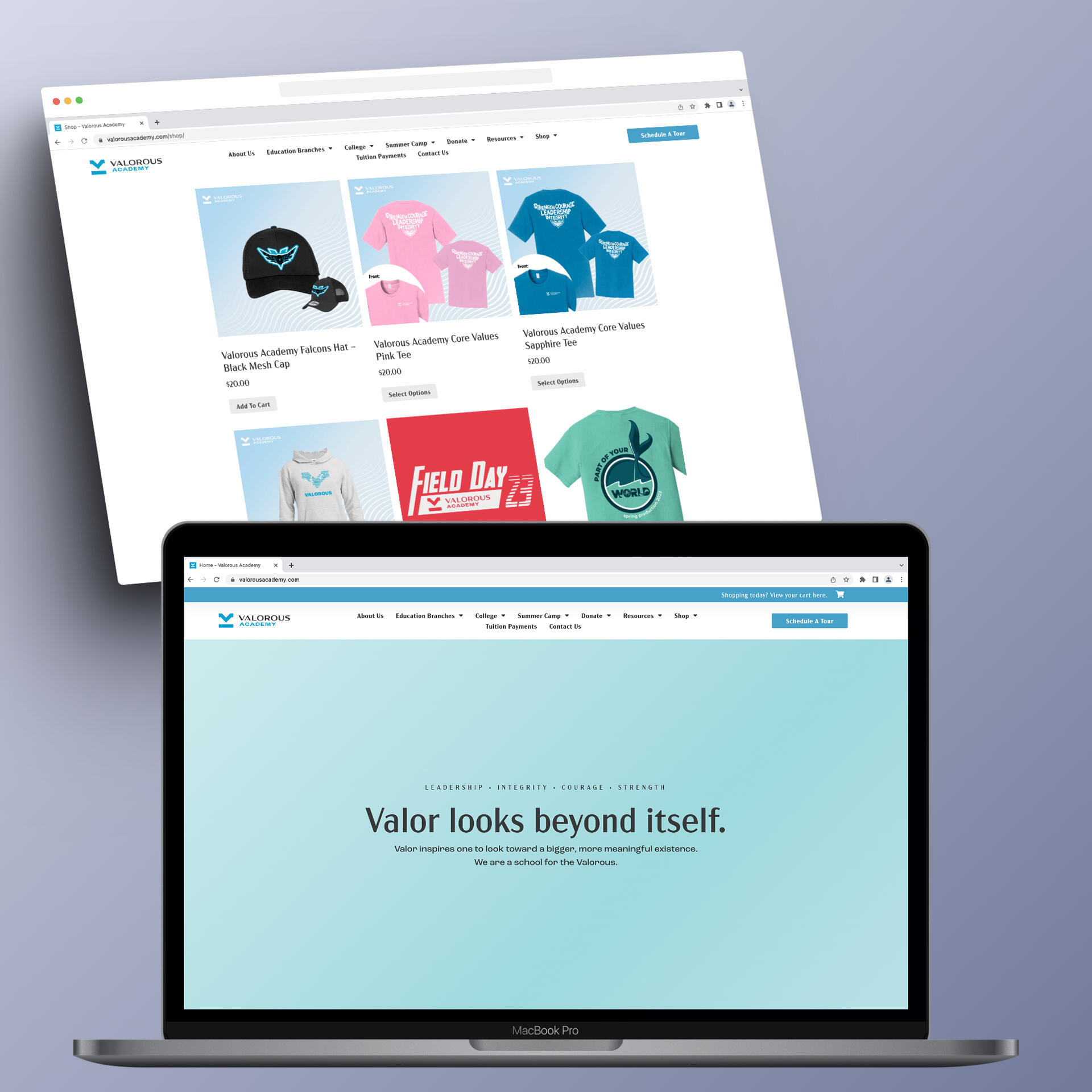
This private school's parent organization rebranded (externally) and with it came the need for a new website and a long list of supporting design assets as they implemented and expanded the new look.Among those include various merchandise designs, copywriting support, banners, print material, and more. Their website spans the Valorous Education family from preschool, K-12th, and college programs. It needed to be robust and structured in a way for parents of current and potential students to navigate and find what they need.
Chris Manning Communities
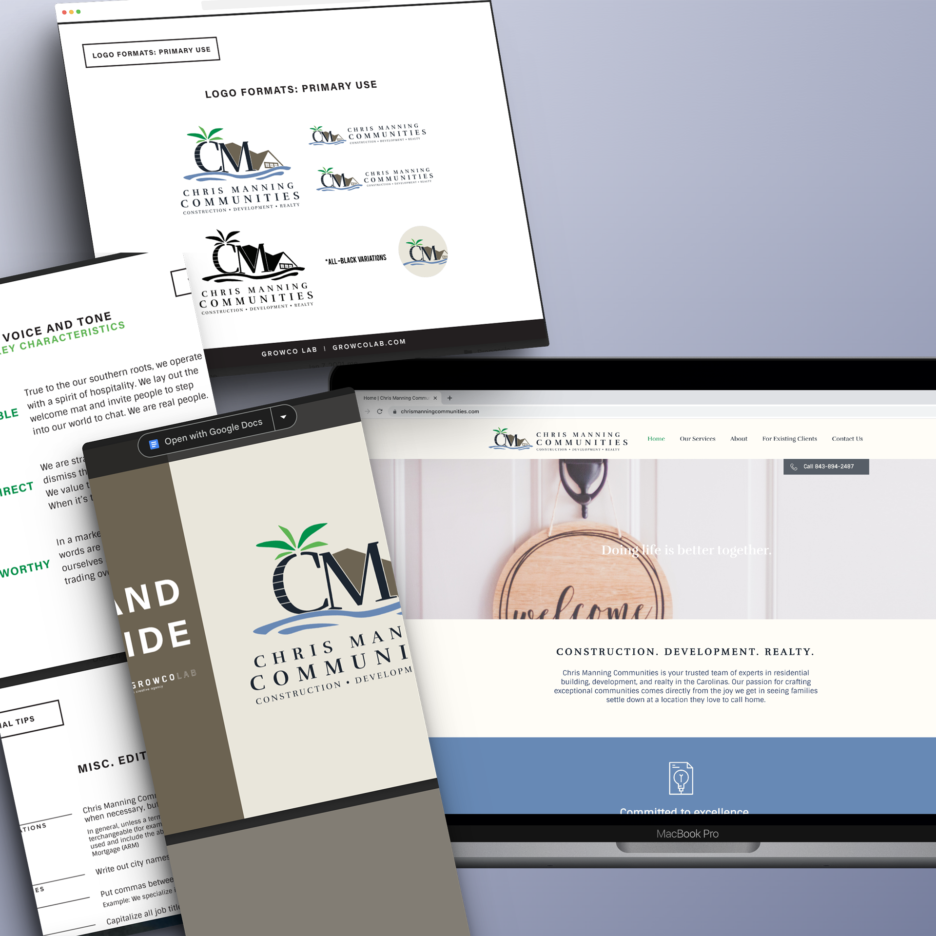
We we began working with Chris and his team, he had a reputable name in the community but multiple business identities that didn't always carry over into their different industries.
Spanning real estate, new construction, and commercial development, he had built multiple successful business ventures over the years. The kicker was if he worked with someone who had a great experience with his real estate team, and they had something like a commercial property for sale, it was all too often that they didn't realize all the industries he works within.The solution we came to was bringing all those industries under one roof. Or better yet, one name. The name that already had built up a strong positive reputation and trust in the community. And to call it what it was: community building. From there, we build out a layered brand identity with systems in place for expansions and sub brands as needed.Their website features copy that maintains the warm, connected, and trustworthy voice of the company culture.
Becoming Me TV
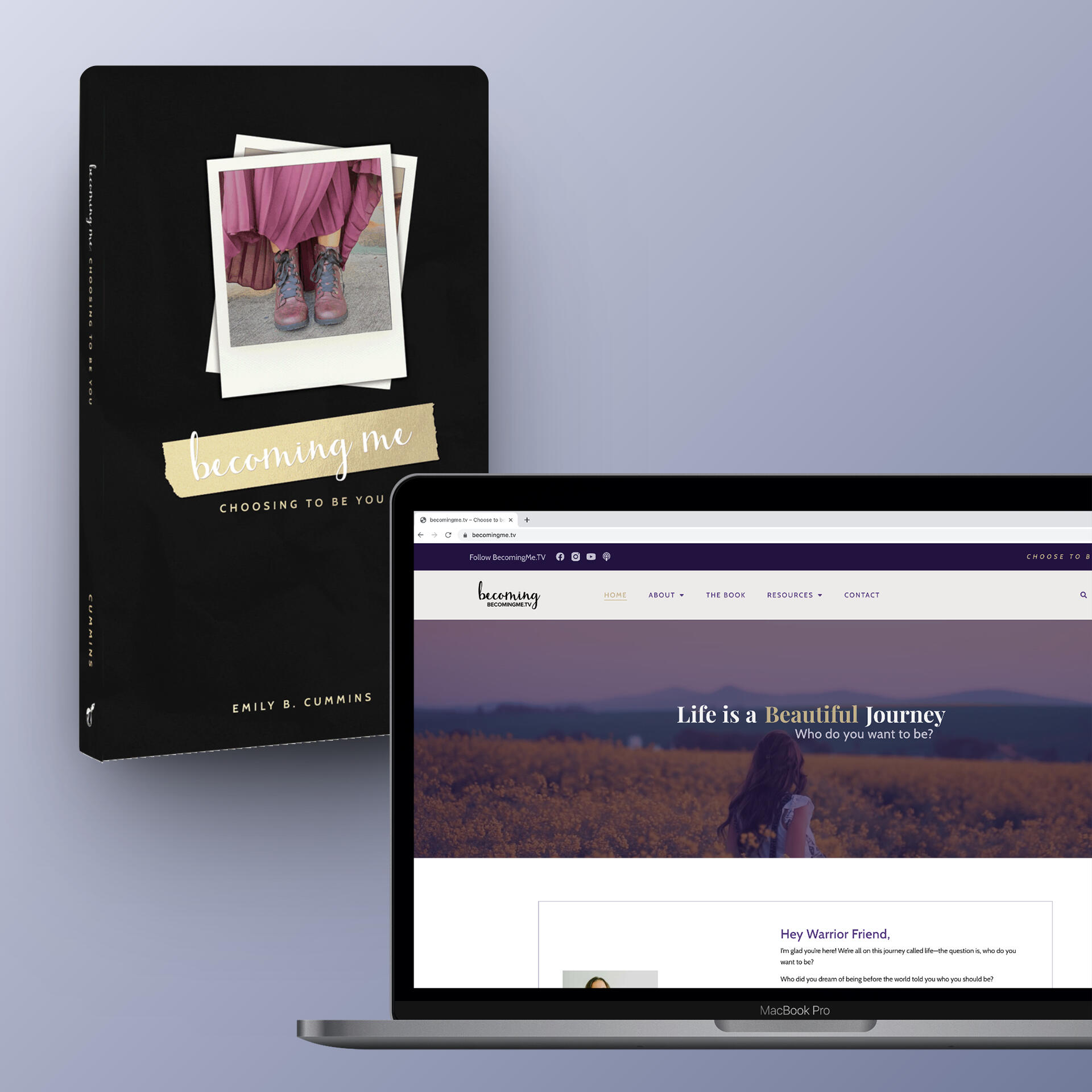
Becoming Me TV is a community built on storytelling and encouragement for life's journey. Being able to partner with founder Emily to make the BMTV user experience on the web cohesive with her first book that published through Amazon KDP.
The website refresh was about a decade coming and just needed a whole modern refresh. Creating systems for blog archives and multiple storytelling formats was a notable need for this build out. And while there have been some amazing things added to the BMTV world over the last year or two, there is more to come for Emily with future coaching and speaking emphasis, which we created space and designs for as well so that this site would grow with the community.When designing the book, we married some of the classic elements of Becoming Stories with an updated design that could be adapted to the blog, podcast, and social media.
Small Batch Fab
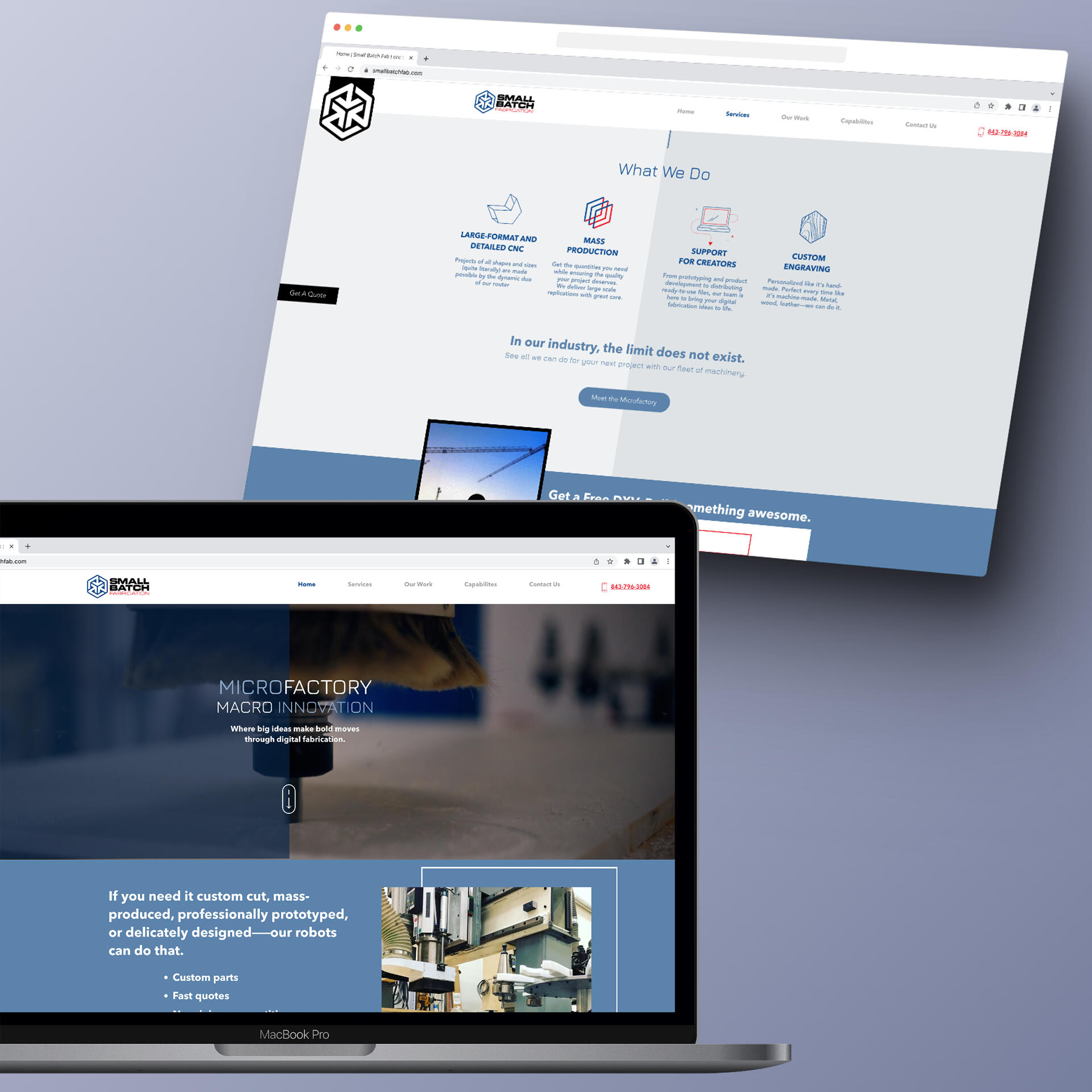
As micro factory making big ideas happen, Small Batch Fab needed an online space that showed off their capabilities and work.
With video, photo, and messaged development to compliment a simple-to-self-maintain web design, that's exactly what was delivered.
OneBody Fitness
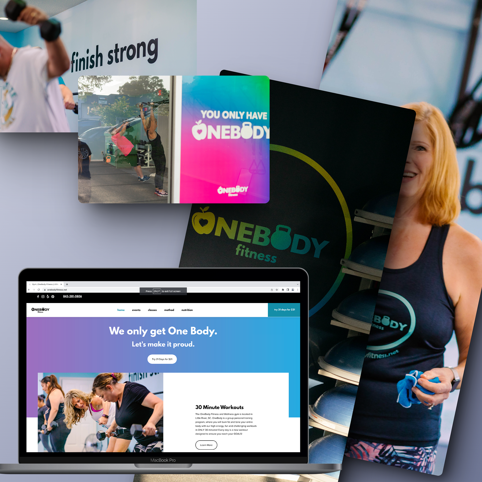
When Ginny took over OneBody Fitness, she wanted to create a gym environment that was colorful, open for all levels of fitness, and chalked full of motivation.
From the branding identity incorporating movement, nutrition, and emotional well-being paired with bright gradients and a friendly, approachable typeface to a space where the windows and walls are a reminder to push through, OneBody Fitness is now just that.
Rustic roast
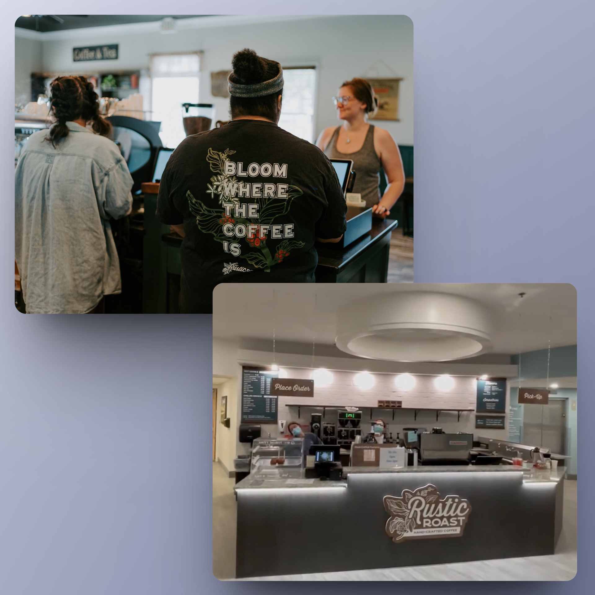
This Conway, SC favorite coffee shop has been a recurring client.
Being able to assist with menu design, large format printing, crafting kiosk setup at a second location, merch, and more has been a blast.
Shaka Laka Bowls NMB
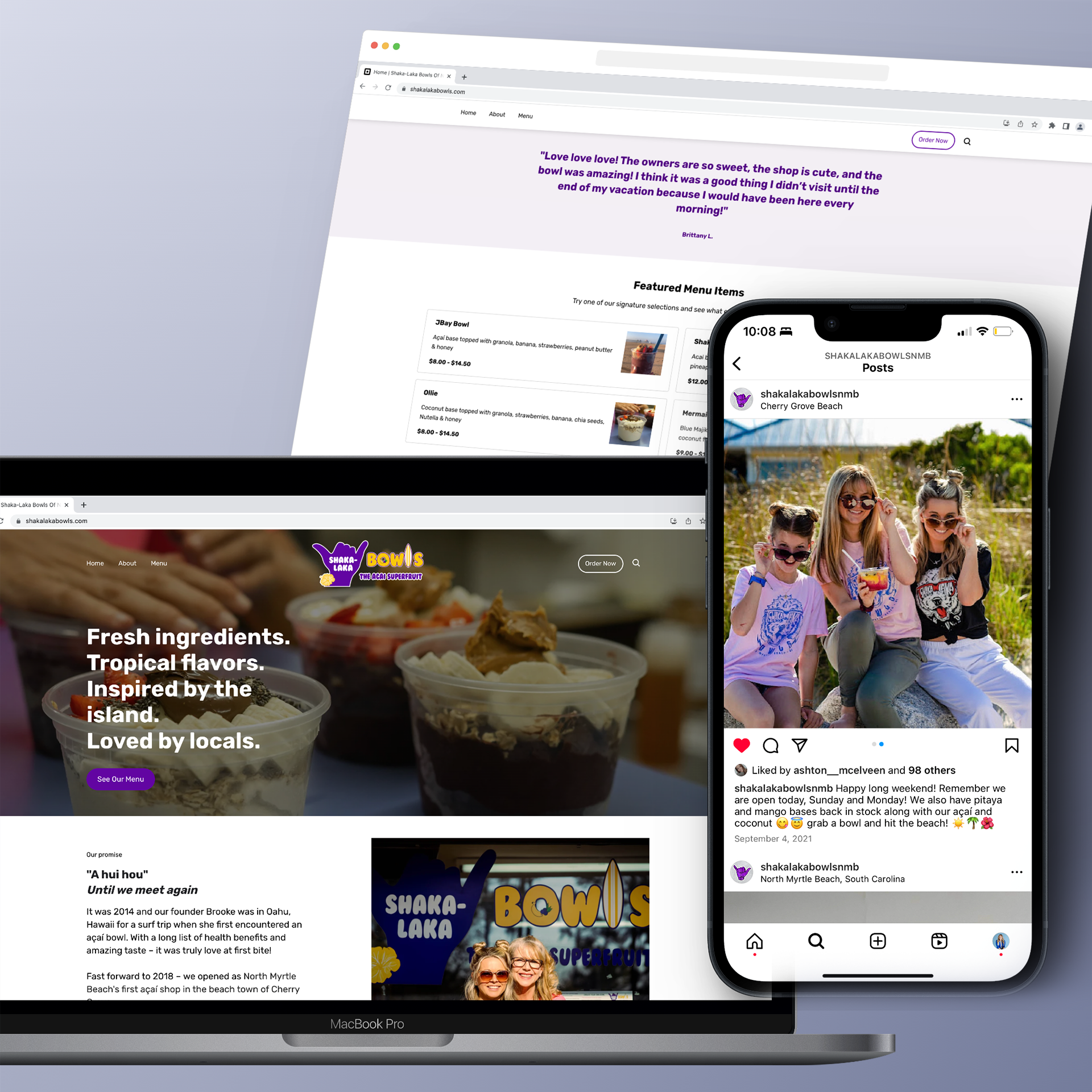
When the premiere açaí bowl shop of North Myrtle Beach needed their ordering system and website up to par with their next-level service and product, Growco Lab came to deliver.
We started with a branding photoshoot to show the colorful craft açaí bowls "in the wild" with some of the shop's beloved regulars and staff. Those photos paired with some island-inspired copywriting with a touch of storytelling and integration with the shop's POS for mobile ordering made this project one fresh take.
Elevation Blinds
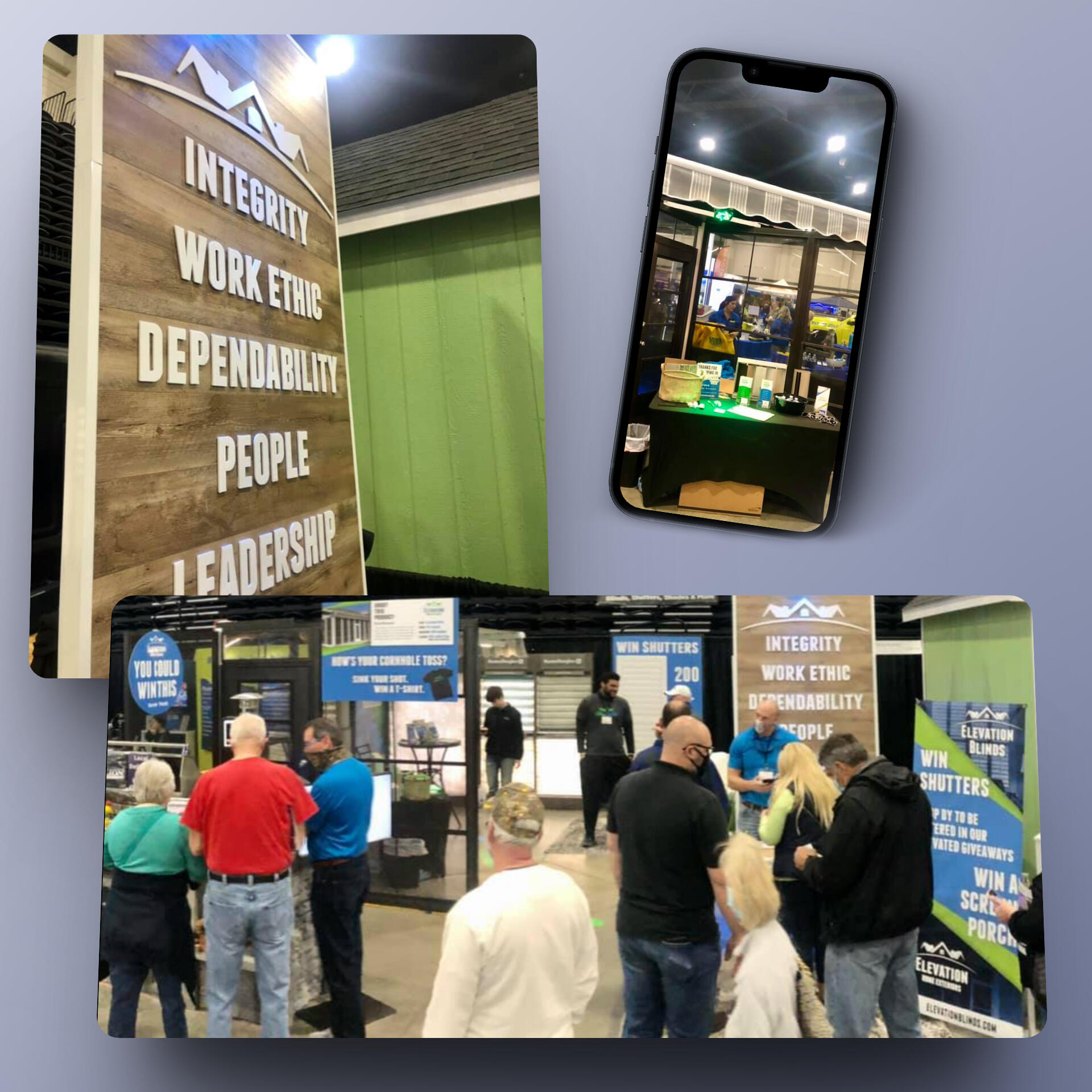
While Elevation Blinds has been a repeating client over the years, a highlight was assisting them with a trade show experience that set them apart from the rest and converted to real, warm leads.
When sitting down with the EB team, it was important to be clear on the focal points of the show, the displays that were nonnegotiable, and then fill the rest with the elements that really make a difference.We curated their allotted space to pull and guide folks from the show from passing observers, to engaged and curious, to connected and impressed. With details like corn hole, giveaways, and thoughtful booth flow sprinkled with company values and well-designed signage, this show was a smashing success and became a template for years to follow.
Owl Street Content
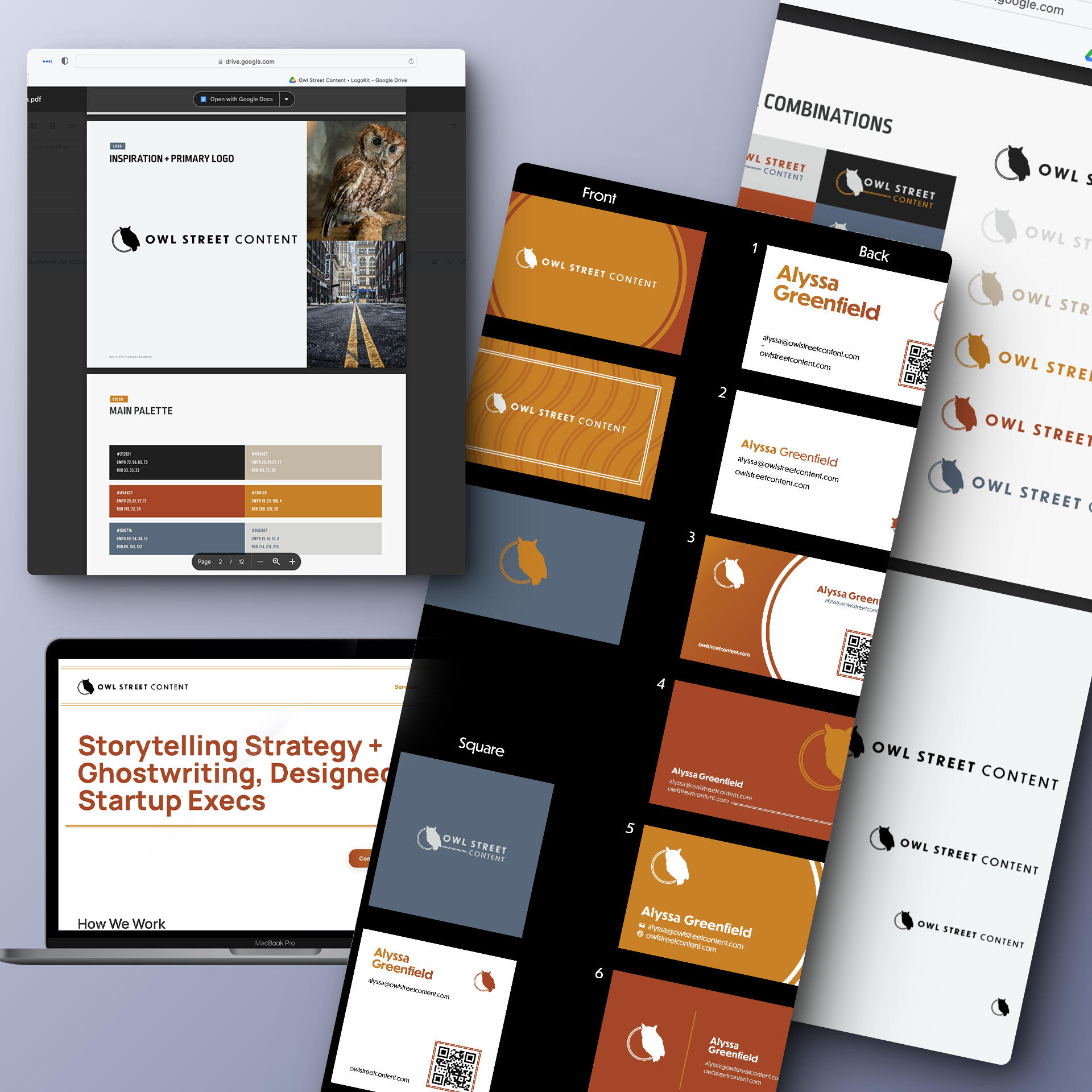
When Alyssa came in, she had a company name but needed a visual identity that she felt just as confident and connected to.
By going through the branding process, we landed on a super clean and crisp hybrid of the yellow lines of the street and the owl that was Alyssa's muse. She has since grown and shapeshifter her company focuses, but her branding, print, and web designs gave her a foundational start to this new chapter that she has been able to build upon with the natural evolution of business.
Gretel Uys Life Coach
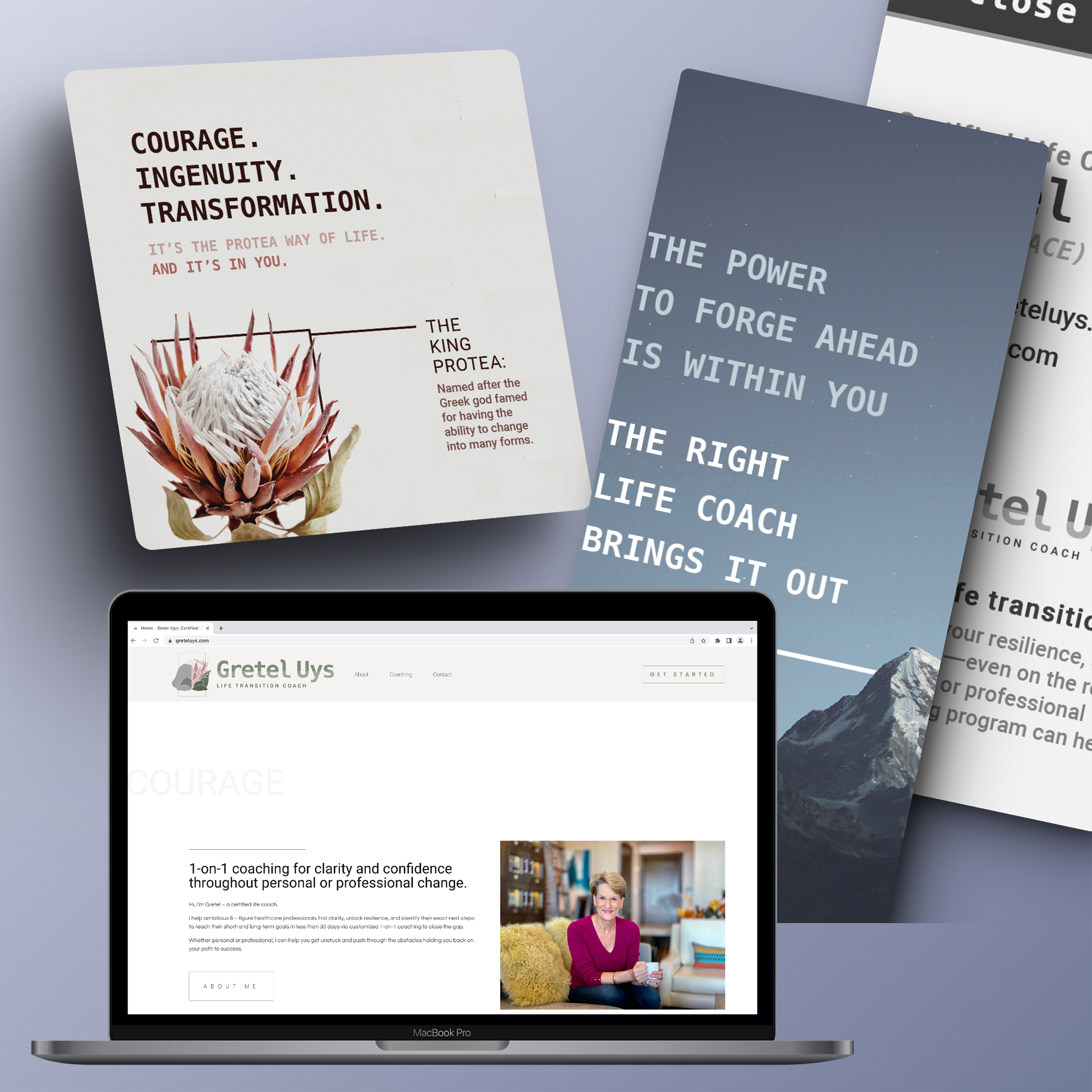
Gretel needed a brand identity that held space for contrast, growth, and transformation.
With her South African roots, we found inspiration from the native King Protea flower and put that soft visual up against the rugged and challenge a mountain represented. Growth and the gap became the duality her coaching business embodied.Her website was designed with lots of breathing room, qualifying Gretel by sharing insights from her lived experience, and integrations with Honeybook.
Club Loco Vacation Club